A great mobile app stands out in both appearance, ease of use and features. The use of animation adds subtle beauty, functional ease and elements of user-friendliness to the app. This is why UI/UX developer needs to know the intricacies of using animation to the benefit of the mobile app users. Today, a beautiful mobile app design is a basic criterion and use of animation throughput subtle layers can do a lot to the users.
Are you a mobile app design and do you want to build an app an with excellent look, feel and usability? Let us explain here 10 creative ways to use animation in mobile apps.
10 Best Ways to Use Animation in Mobile Apps.
1. Visual Feedback
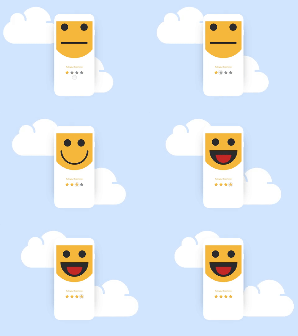
Visual feedback is an irreplaceable element in any user interface. Just the way real-world objects move with our pushes, in the digital platforms also the audience expect a similar responsiveness from the screen elements. For example, with swiping gestures and finger taps a button can move or the screen can show some transitions. These are visual feedback to user interactions.
This visual feedback not only creates a more fluid, simple, and responsive user experience, but they also make the app smart and beautiful in look. No wonder that animation across the user interfaces is mostly used for visual feedback.
2. Progress Animation
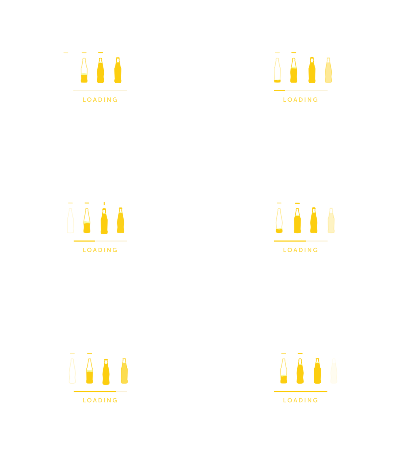
Mobile app users are extremely restless and hectic these days. They have the least patience for anything taking too long to load. It is mainly because they have too many choices to opt from. They also have faster internet and expectation of a highly sophisticated user experience. Naturally, there is too much fuss about loading speed among the developers. But even the fast loading speed is not always enough. The restless audience needs something to chew on while the app is loading.
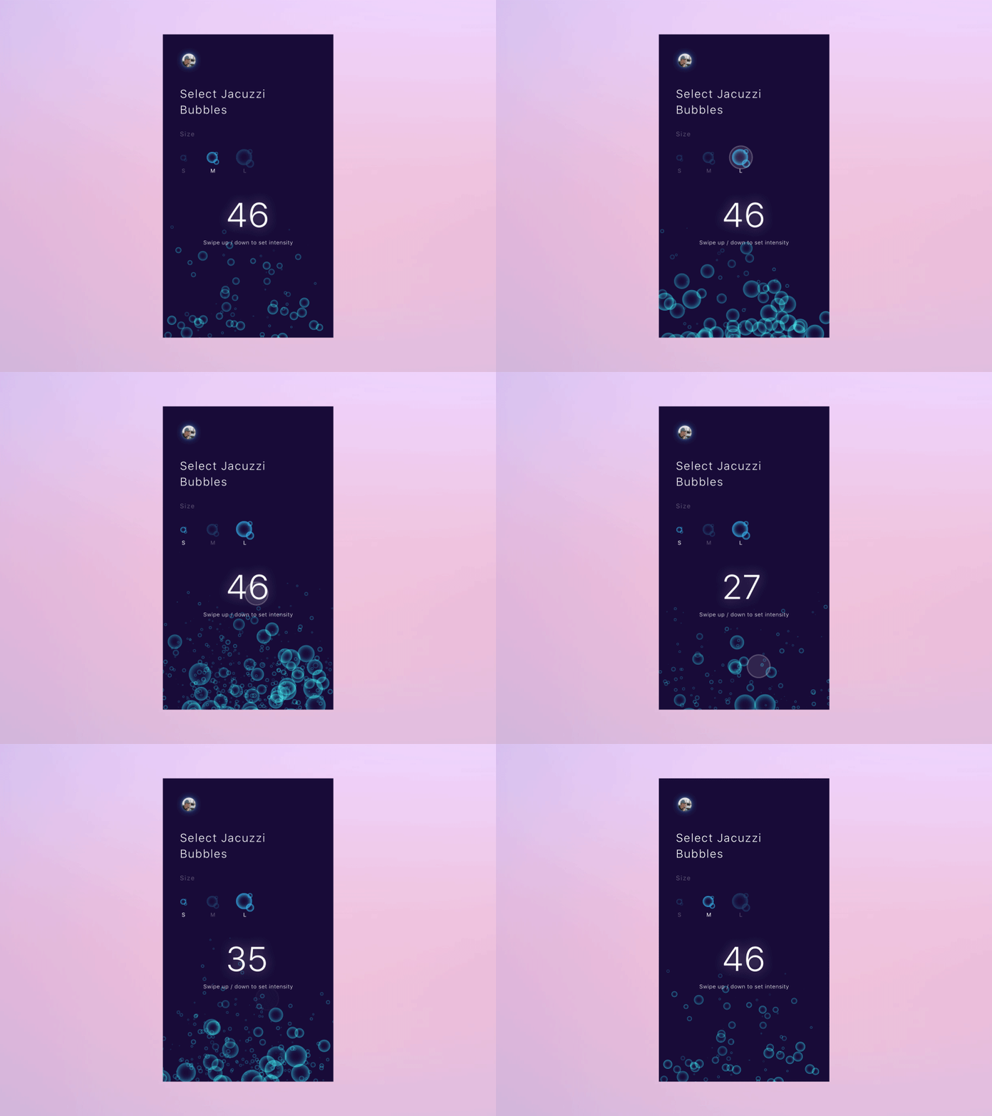
An interactive animation that visually shows that the app loading is progressing can serve the purpose. The user while seeing the moving animation referring to the progress of app loading actually keeps users engaged for some fleeting seconds. Now, instead of using boring graphics for showing the progress you can use innovative and entertaining ones to keep users entertained and engaged.
3. Animated Login Screens
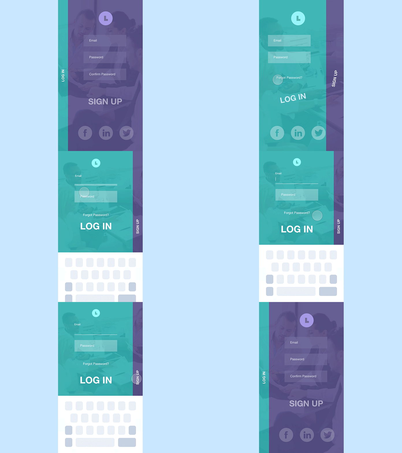
Who said login screen will always look boring and dull? You can even give a visual twist to the login screen with subtle animation. Based on your app niche and target audience, you can create a background illusion for the login screen. The background animation in the login screen can also be used to explain the purpose of the app quickly. This will help convincing new users to log in before starting to use the app.
4. Navigation
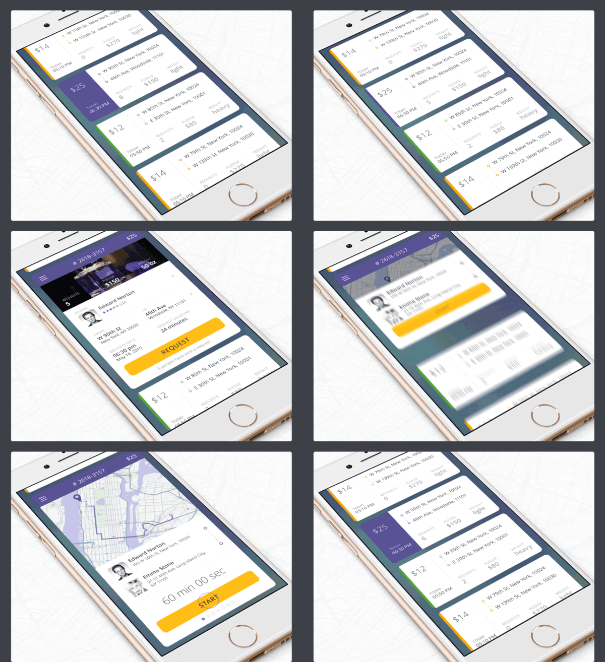
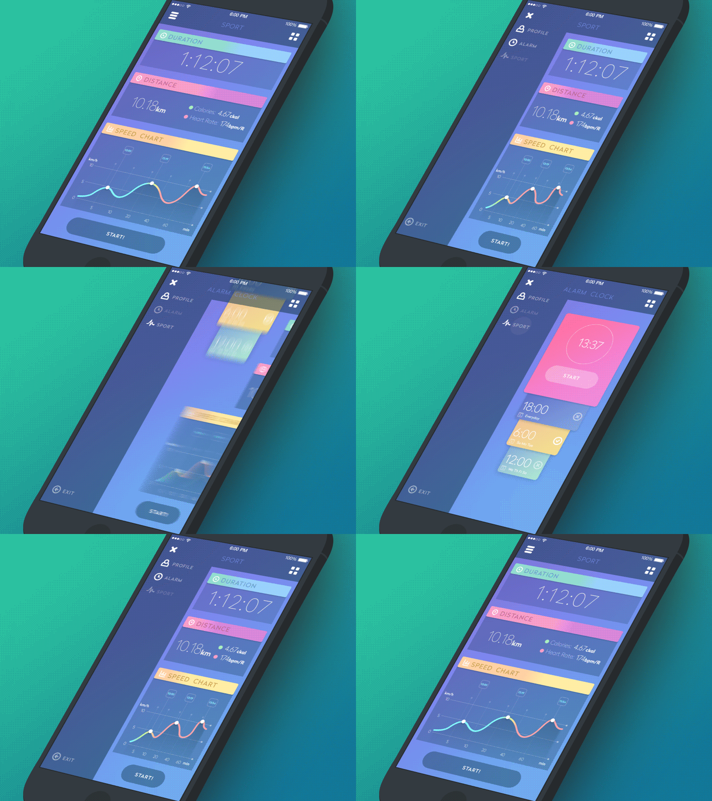
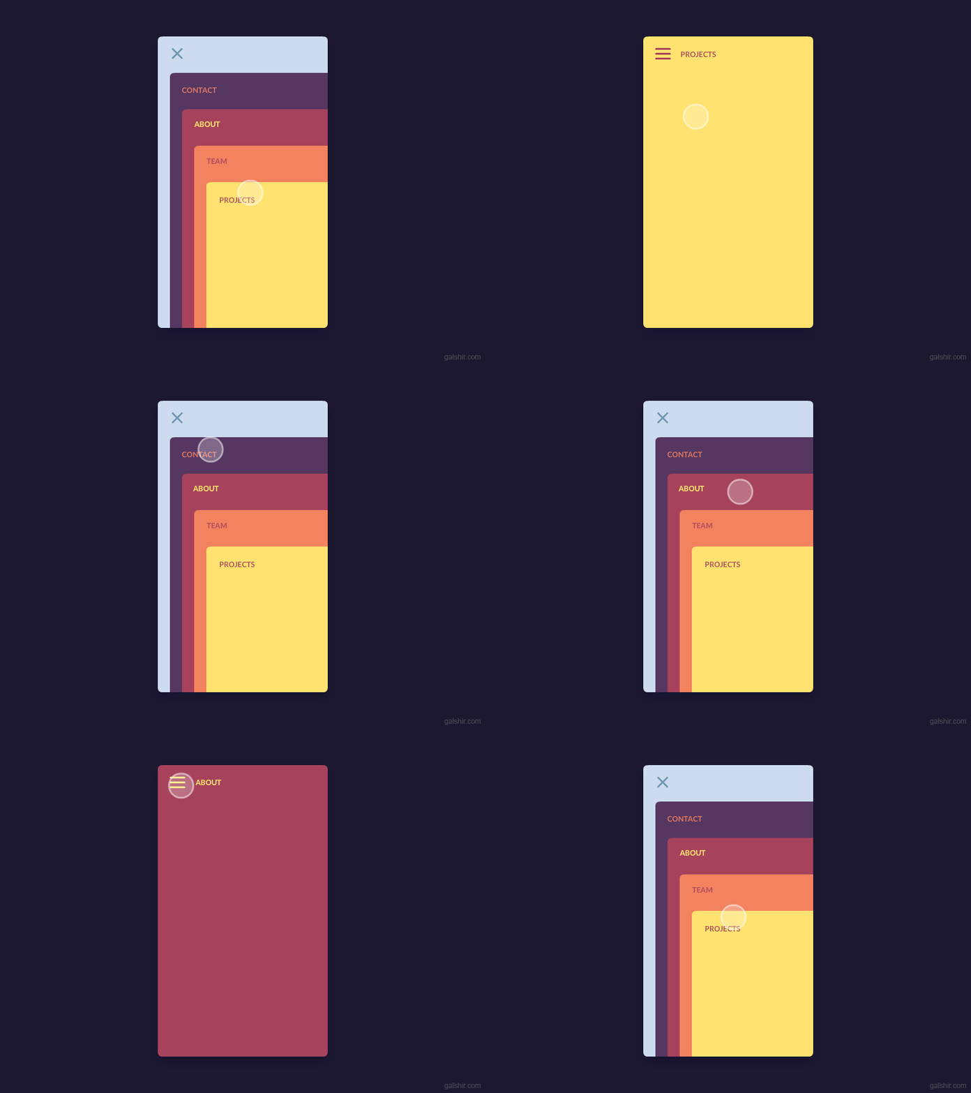
In most apps, the hamburger menu drops down showing the features or the app sections for the users to navigate. But in the case of apps with complicated structure and too many elements and sections animation is used as a visual navigation element. Just by selecting from a visual selection on the screen the user can navigate across pages. When clicking or navigating by selecting on-screen elements the background visuals can change and signs can be used to help users navigate in a particular direction.
5. Displaying Changes
Animations can also work as clues to app information. Just by clicking on a button, you can see an on-screen pop-up displaying additional information. Just by swiping the app can drop down a list of features. By clicking on a slider, the app can continue to play a slideshow of images. These interactive animations that show and open up additional information is a smarter way to use animation for better user experience. It is important to maintain the conventional aspects of animation based interaction for using such animation.
6. In-App Guide
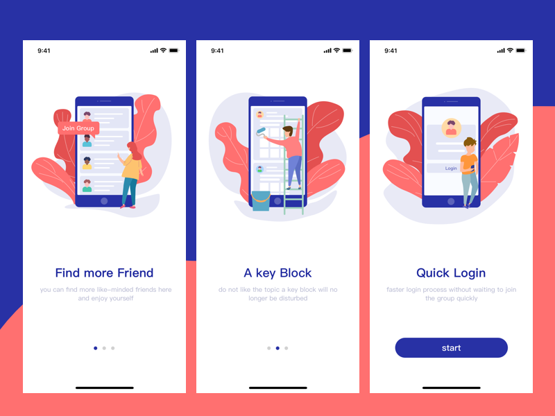
A new or infrequent app user is more likely to get away from your app if he finds your app unsatisfactory in user experience. This is why for complex apps with complicated and multilayered information structure it is important to explain the features and how the app works at the very beginning. Animation can be color as the ideal solution for this. Just an on-screen layer with animated instructions appearing with a user’s progress through the app can explain how the app works. Though a comprehensive user manual or guide should always be there, such visual guidance can actually work better to keep users engaged.
7. Microinteraction
Microinteractions refer to the small and subtle app elements that continue to inform, give feedback and guide users throughout the UI/UX design. These subtle and almost non-noticeable elements that subtly make the user experience better can be used with animated effects better. Just like a ‘Beep’ sound at the end of a process, an accompanying animation can inform the user visually. Though these interactions are subtle, they in totality make the user experience of an app better.
8. Meaningful Transitions
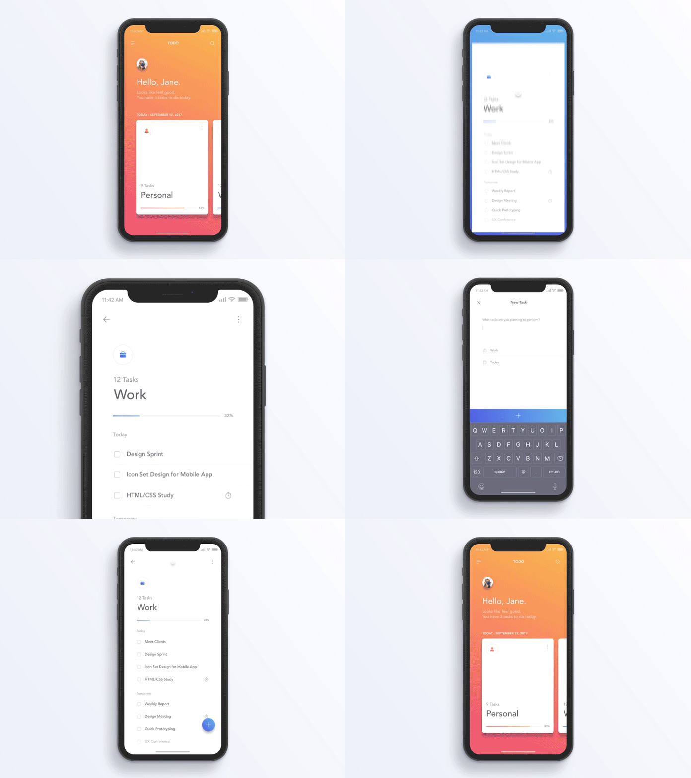
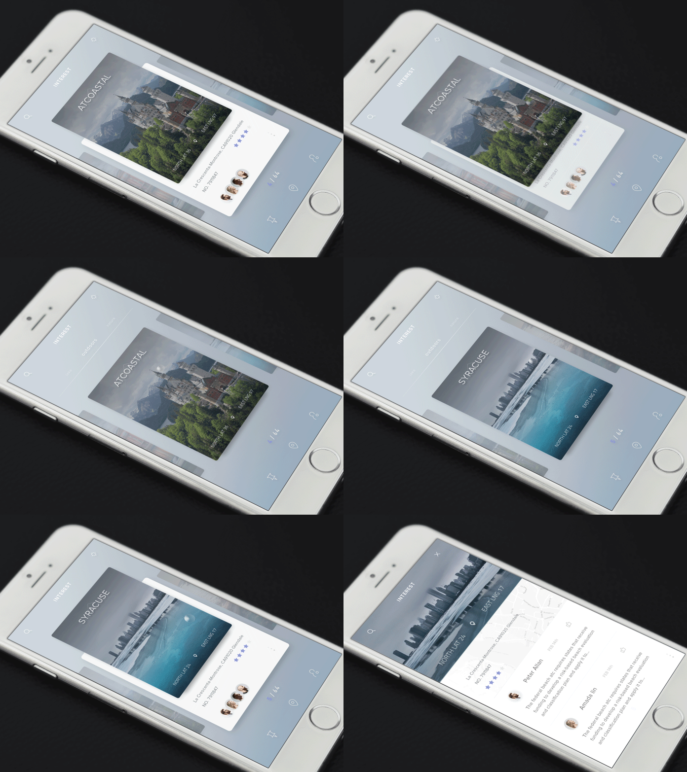
For allowing transition from one app page to another meaningful animation can be used. The on-screen visual elements can lead to different screen transitory animated effects. The transition of one visual state to another with the help of animation can make users more informed about what is happening and the reason for this change.
9. Hierarchy of Elements
There can be many visual elements in a screen but a hierarchical order binds all of them together. A hierarchy of buttons, navigation menu elements, list of features or app sections presented on the screen can be given a sense of priority for making one element prominent over the other through the use of animation. Animated effects along with a proper color scheme can easily create visual hierarchy.
10. Custom Animation
Finally, you can always make use of animation in your own special way to make your UI/UX better in too many different ways. By using custom animation you can easily make users remember the app easily. The customized visual effects can create a lasting impression and pull user attention easily to your app. The use of custom animation can also help to create a branding element that over time can be looked upon as the signature for your business brand.
While using custom animation it is important to maintain restraint and never overdoing it. You need to keep users engaged with your app and make a brand signature with the custom animation. But the animation should not in any way make users distract from your app content and the things you want your users to concentrate upon through your app.
Animated effects are used across digital interfaces for years. But the evolution of the use of animation continued to become smarter and more intuitive with the passing of time. While using animation, you should take extreme care so that the animated effects do not look cliche and repetitive. The animation should bring a fresh visual effect to the UI/UX of your app.


