Ask any insurance company management about how they take a revision of the team performance and output in the weekly meeting or through day-to-day reports, you will know that most of their team members and field staff often do not have all the relevant data at their finger tap. As for claim settlement and processing also, comprehensive data management and data visualization still remain a big challenge.
Lack of data visualization make insurance companies lose revenue, destroy customer confidence, pulls down efficiency level and makes way for lack of collaboration.
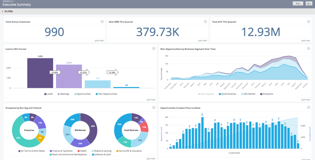
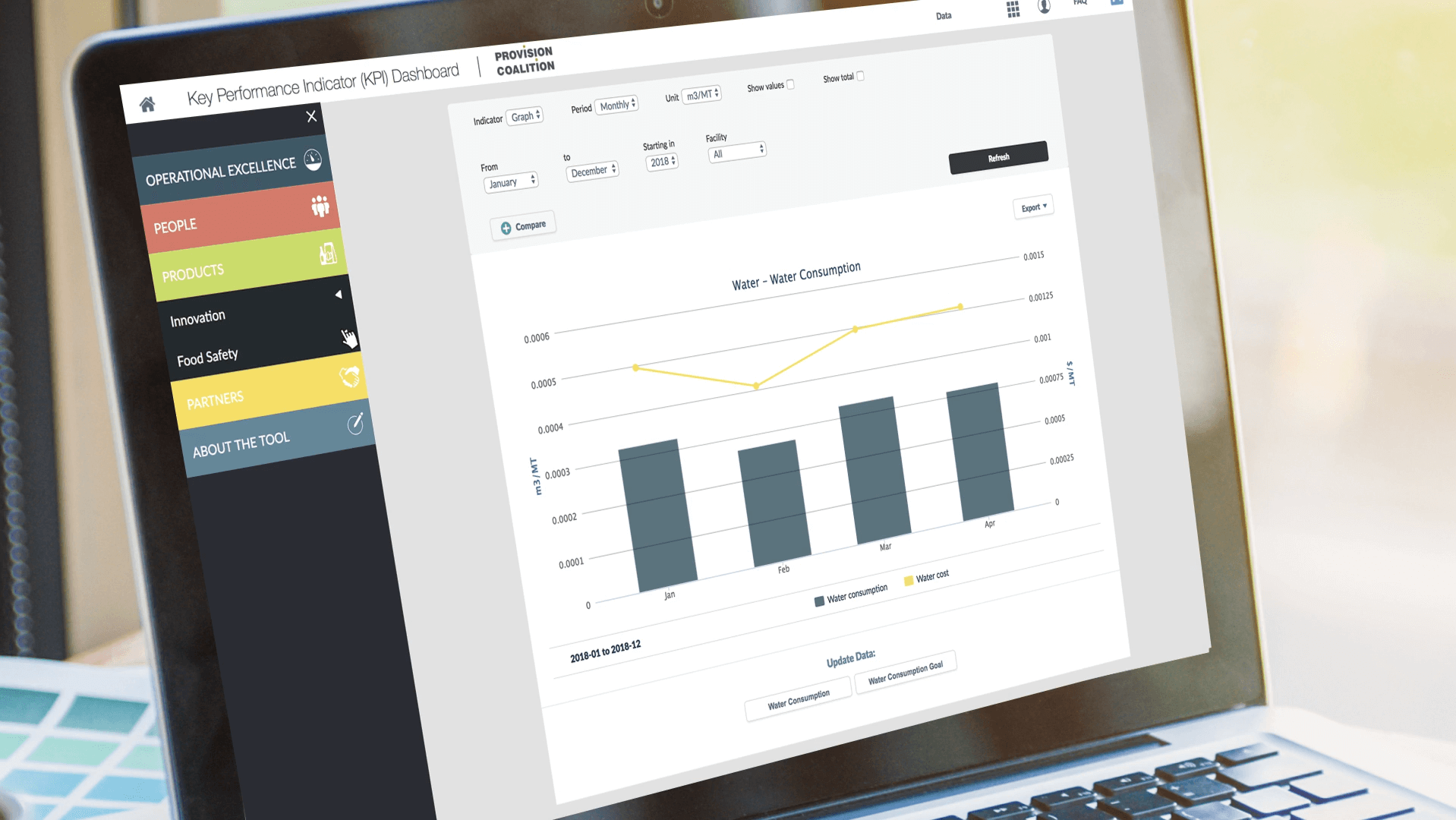
Can these challenges be mitigated by any of the insurance IT solutions integrated into websites and mobile apps? Yes, data-driven dashboards with robust data visualization and important KPIs can really help in boosting efficiency, business and customer trust.
How Dashboards Bring in A Data-Driven Culture?

Insurance companies working on data-driven dashboards must understand the positive outcome of these dashboards actually benefits the company and ultimately helps establishing a data-driven culture. Let’s look at some key benefits.
- Dashboards showcasing your ups and downs with important metrics and numbers help you taking more grounded decisions.
- Dashboards helps reduce the entire visual cacophony and clutter to help people see information in a more organised manner.
- Dashboards also boosts precise prediction based on actual data and this in turn helps the companies to deliver a better strategy.
- Dashboards by employing much-improved data visualization help incorporating new data and to update the data funnel with more accuracy.
Most Important Metrics for Dashboards
Data-driven dashboards become effective thanks to the various metrics that make the evaluation process easier. Let us explain some helpful metrics in brief below.
- Cost for Each Claim: This metric showcases the data corresponding to the money spent on an average for each claim.
- Targets vs. Production: This data showcases the actual state of sales against the sales target for insurance agents.
- Sales Growth: The percentage of sales growth over a particular period like a financial quarter or a year clearly identifies the ups and downs for sales.
- Sales Brokers: This metric visually showcases the top insurance brokers and their key performance details in numbers.
- Average Time for Settlement: Average time for settlement actually shows how much time a company takes to settle a claim on an average.
Important KPI Metrics For Insurance Sector
Now, we need to have a look at some of the real insurance data and their related key performance indicators (KPI) that will be a part of your visual dashboard. Let’s have a look at the examples of KPI metrics for insurance company dashboard.
- Net income: This metric shows how much money on average your insurance company is making from the premiums. This may help you to make a few adjustments for pushing the growth in net income.
- Sales growth: This KPI graphic will showcase how the insurance company is retaining its customers and how much renewals of policies are taking place.
- Policy sales: This data point showcase how much sales of insurance policies your company is generating.
- Claims ratio: This KPI shows the percentage of settled claims vs total claims actually help revealing fraudulent claims and policies.
- Settlement time: This graphic data visualization shows how much time the company is actually taking to settle claims in time and how many settlements are delayed.
- Cost per claim: This KPI showing per claim cost actually reveals the fluctuations in cost over time. This helps management in planning for maintaining profitability in the future.
Key Dashboard Development Principles
Instead of running for a web app development company experienced in building analytics dashboard, you need to be fully aware of the common pitfalls, challenges, and issues that you need to mitigate. Well, here we explain the key principles for building a data-driven dashboard.
Build it Purpose-Driven:
Before starting with the development figure out the objectives that the dashboard is going to serve. You need to have a clear idea about what the audience is going to find out through the dashboard. For every visual data display, you need to ensure it serves a specific purpose and answers a particular question in a very definitive manner.
Depend on a Robust and Reliable Pool of Data:
A great pool of most relevant data is something works like the foundation for a superb data-driven dashboard complete with specific data visualization. Consider some robust and reputed Business Intelligence (BI) tools that can help you incorporate various data points with clear emphasis on providing answers to the questions.
Keep the Semantic Understanding in Mind:
The semantic aspects actually help you go deeper into the data and draw data-driven insights and relevant understanding beyond the immediate facts and figures. While the tools will generate data visualization in minutes, with the semantic understanding you can actually make it more self-evident and instantly understandable.
Do Away With the Clutter and Cacophony:
One of the biggest problems for many dashboards is the visual clutter that doesn’t allow easy perception and understanding without distractions. While using a lot of negative or white space is one way to clear the clutter, the dashboard also needs to organise the data points more effectively to grab attention easily.
Keep the Dashboard UI Consistent, Clean and Easy to Understand:
For a visually appealing dashboard that appears consistent, clean and that grabs attention to data points without efforts, follow a particular logic and pattern throughout. While you can always find ready to use themes, always take a pause and analyze before progressing.
Dashboard Development for Insurance Sector
Now, for building the dashboard we need to take a deeper look at the corresponding stages and steps. When you Hire Dedicated Programmers India for this purpose, do remember the following steps.
Dashboard into Website Development
First, you need to incorporate dashboard into your insurance company website with the following design and development principles.
- Mobile-optimized and responsive web design
- A consistent dashboard framework design
- Integration of third-party BI tools
- Integrating cloud hosting services like Google Cloud, AWS, Azure, etc. besides the options of traditional hosting.
API Design for Dashboard Development
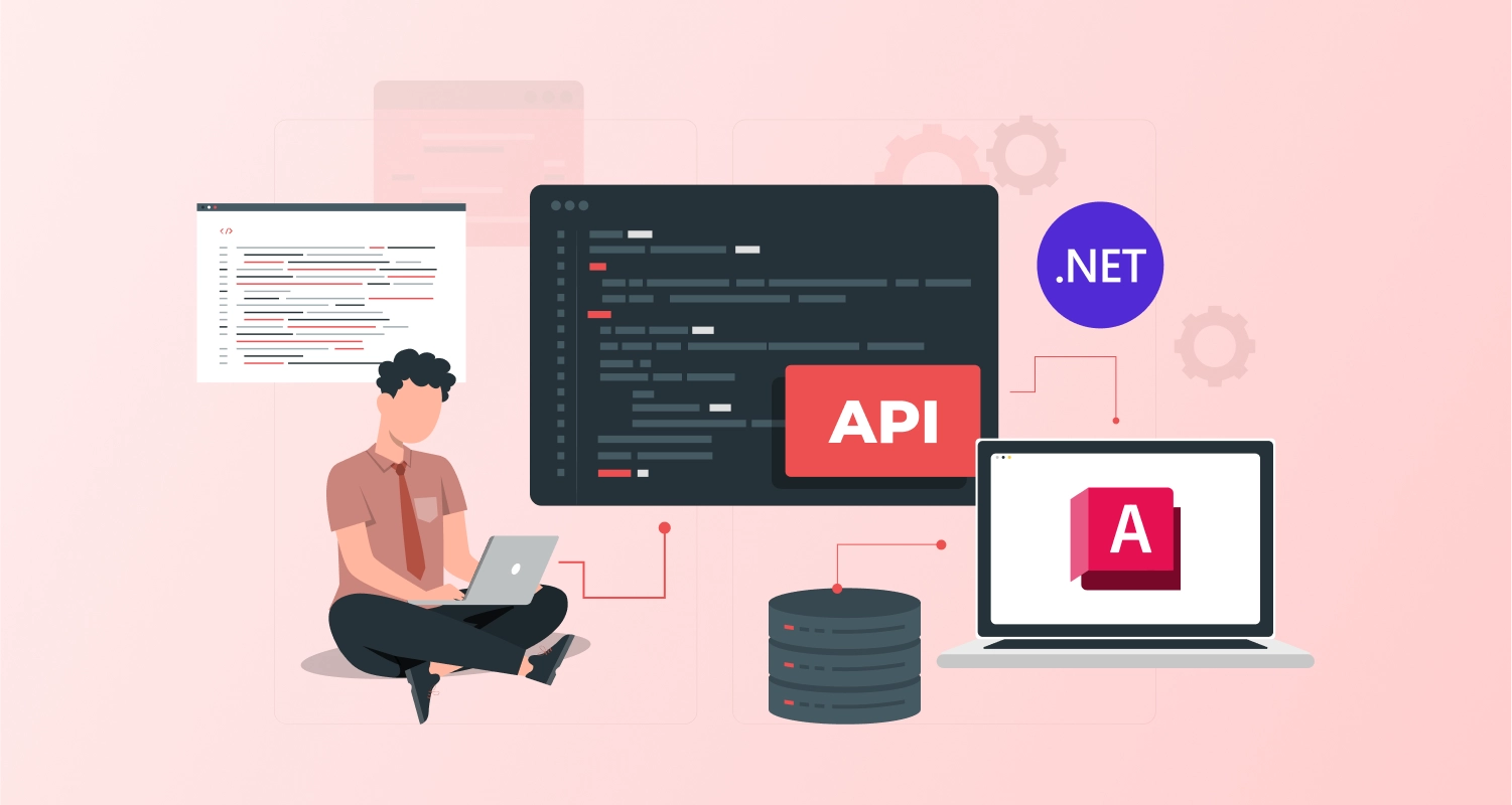
Application programming interfaces (API) need to be built for accessing relevant data from various relevant systems, devices, and operating systems. A well-built API helps to access data from a variety of sources without any friction. Here are the API design principles for the dashboard.
- Easy and frictionless data access from diverse programming languages and platforms through HTTPS, WebSockets, etc.
- Using acclaimed data formats like JSON and XML to make data more understandable.
- Smooth Integration with third-party systems.
Why Data-Driven Dashboard is So Important for Insurance Companies?
The data-driven dashboards offer a great array of advantages for insurance companies. The importance of visually-optimized KPI dashboard for the insurance industry can be summarized with the following points.
- As the insurance sector is highly exposed to data manipulation, frauds and misrepresentation of data, data-driven dashboards with accurate and relevant data visuals can help mitigate such risks to a great extent.
- Data-Driven dashboards can help customers with a pool of relevant information that instantly meets their queries.
- Customers can enjoy round the clock access to key indicators and data points.
- With the data being showcased through website and company apps, data availability and accessibility for everyone boosts transparency.
Conclusion
Data-driven dashboards have already been introduced in the leading insurance company websites. With the tremendous boost they provide to boost transparency and efficiency, these dashboards are likely to become a mainstay in all apps and websites of insurance companies.


