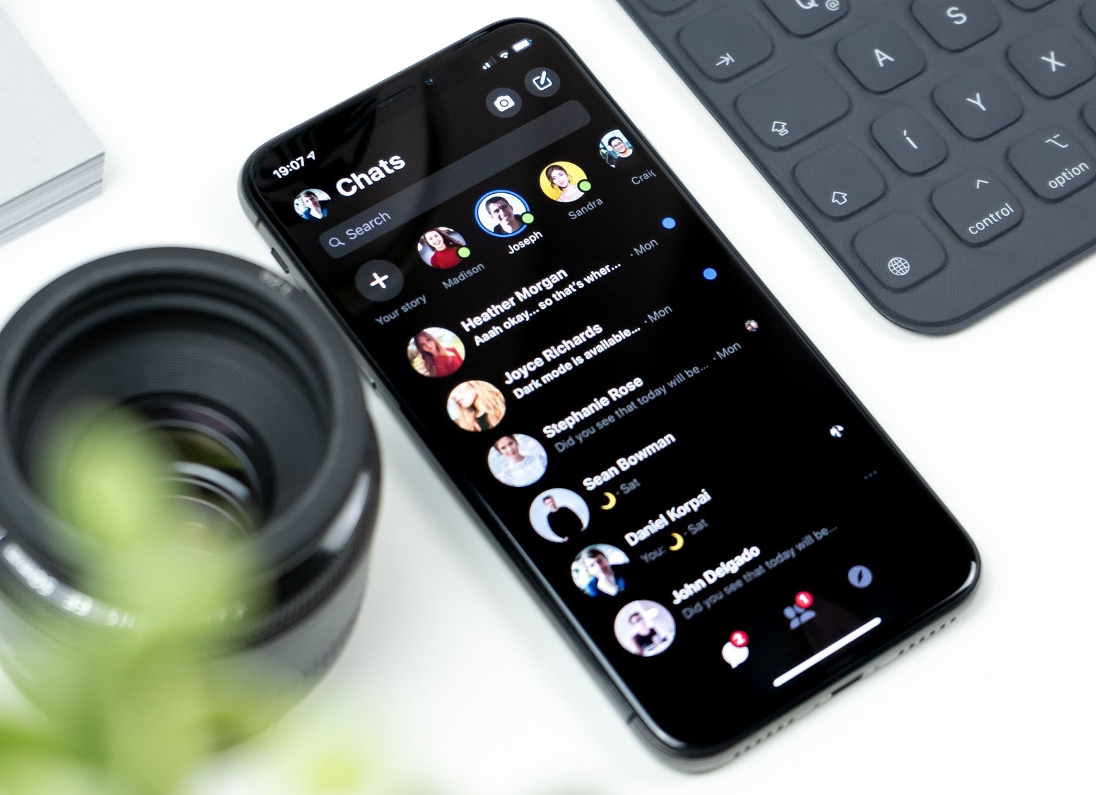
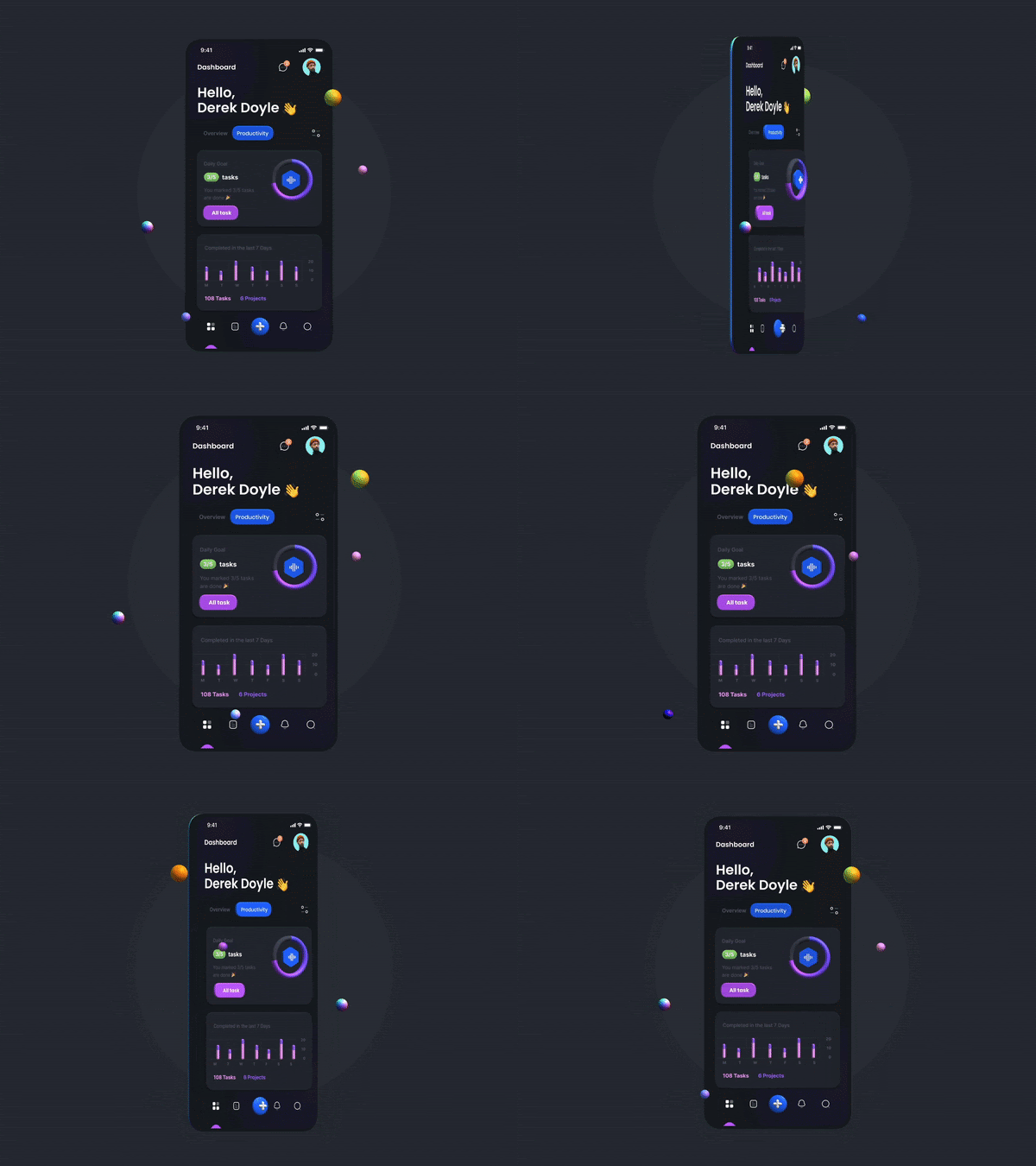
Finally, both mobile platforms, Android and iOS have embraced Dark Mode. The Android Q and iOS 13 both now provide the users a complete scope of using the dark screen. The Dark Mode feature, apart from increasing the comfort of accessing the phone screen in a dark place, also offers a bounty of useful features.
To understand how Dark Mode became popular it is important to understand the derogatory impact of the bright screen. When comparing dark mode vs light mode, many think that the bright theme of the phone doesn’t make a big threat, but the uncomfortable and painful bright flash of light emanating from the device at night time can really be disturbing on many occasions.
Apart from affecting the eyesight and vision negatively, the bright light actually reduces your ability to concentrate and continue to work for a prolonged time. This is why Dark Mode brought great relief to mobile users who access the phone late at night or outdoors during the evening.
Though mobile app designers and developers, in the beginning, didn’t give serious importance to the Dark Mode benefits, it continued to gain popularity as users found it more engaging. Finally, by taking user pain points into consideration, most leading mobile app development services India have embraced Dark Mode for their app projects.
The Key Advantages Of Dark Mode
Though we already briefly explained how Dark Mode makes a positive impact on the user experience, here let us have a detailed understanding of the key advantages of this. Before you hire dedicated app developers, you must ensure the team is the same age regarding the benefits of Dark Mode.
Dark Mode for User Health and Comfort
We all have a distinct visual response when the lights are turned down in a room and white light from our device flashes in our eyes. According to many users, it is not only about the painful eyes that we experience by looking at the bright screen, this exposure to bright light actually disturbs the secretion of the sleep-inducing melatonin hormone and ends up increasing the stress level.
Since we have the habit of using mobile devices in the leisurely hours of the night with everybody cocooned in their comfortable rendezvous with social media, chat, or streaming apps, the bright screens slowly take a toll on our health.
Saving Device Power and Battery Life
Ultimately, apps and device screens with dark screens can increase the battery life of the device and that is a big reason for iOS and Android to embrace Dark Mode for their latest OS versions.
According to Google, the dark mode used on OLED screens can save a considerable amount of battery life. According to studies, with just 50% brightness activated by the Dark Mode, an app can easily save 15% more battery power than white screens.
Since both Google and Apple have embraced OLED screens for all their leading flagship models, the Dark Mode will play a great role in saving battery power.
Related: 8 Time-Tested Dark-Theme Design Tips To Advance Dashboard Development
Sophisticated and Rich Look and Feel
Now coming to aesthetics, dark mode truly gives a very sophisticated and stunning look and feel that can quickly grab attention and can make things worth remembering thanks to the visual experience.
To make the app aesthetics more easily engaging, the Dark Mode allows colors to be more captivating by Mai raining proper contrast. With the dark backgrounds, the colors pop up and drag attention easily.
Moreover, the white screen remained to be the normal state of Things fir app aesthetics in all these years and now Dark Mode is just offering a fresh new look and feel that users are increasingly finding interesting and engaging.
Lastly, when your eyes consume less screen light, it can stay longer on the screen and ensure more engagement.
Designing the Dark Mode: Best Practices to Consider
Already both Google and Apple have come up with their specific dark mode design standards. Apart from maintaining these standards, it is important to ensure following the best practices for designing apps in Dark Mode.
Here we explain the best practices for Dark Mode design.
Don’t Use Saturated Colours
Though the saturated colours always look stunning and visually captivating on bright surfaces, they create more vibration on dark surfaces and thus creates more challenges for a smooth visual and reading experience.
This is why it is advisable to use colours within the 200 to 50 range of colours with lighter tones. These colours actually ensure optimum readability and a smooth visual experience.
Reduce Use of Bigger Areas with Bright Colours
When we use light themes with dominant white shade or other light colours, large blocks or bright or saturated colours are quite common. But in the Dark Mode, it is completely useless.
Don’t Use the Pitch Dark Black Colour
Remember, though Dark Mode obviously means using darker shades in the app background and screen, you should not use pitch black colour to make the screen look darker.
Actually, on a high contrast screen, the pitch-black darkness can create more strains on the viewers eyes.
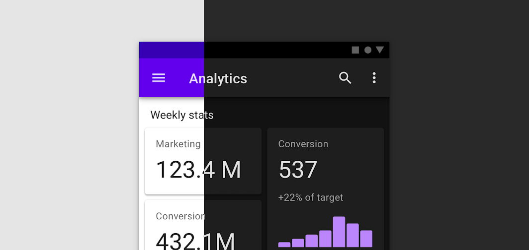
Check the Design in Both Dark and Bright Theme
Not all design looks equally great on Dark and light themes and hence it is important to evaluate their look and feel on both types of themes. Make sure you test the Dark Mode design in different light conditions including twilight, nighttime lights with different effects on the screens.
Give Users Flexibility of Choice
One should be able to choose Dark Mode or light mode as per his or her comfort, eye strains, and preferences. This is why you should not force-feed Dark Mode to your users. Instead, allow them to choose the Dark Mode or light mode as per their choice or necessity.
If you auto-enable Dark Mode, this may cause a detrimental effect on your new user acquisition. On the other hand, giving them both the options to choose from settings will enhance credibility. So, allow users to turn on and turn off Dark Mode as per their wishes.
Make Use of the Elevation Tool
To make the most out of dark theme UI in terms of user engagement, creating hierarchy and stressing on important design components is of extreme significance. You can just make wise use of the elevation tool to create hierarchy and to give meaningful stress where it is due. The elevation tool is used just the same way as a shadow in light mode.
Instead of using shadow, here in Dark Mode lighting up the level surface works better to give relief to the visual objects on the screen. As per the dark theme design protocols, the elevation is the natural way to highlight the desired hierarchy and order of things.
Conclusion
Dark themes in spite of their wide-ranging advantages, are more subtle and involve a lot of delicate design considerations. The use of colours and shades in the right proportion makes the key to a successful dark theme design.


