As Google is continuing to put bigger and better efforts in improving the user experience on every front, the Play Store experience and UI has recently been updated by the tech giant to make things smoother and easier for app browsers on the Android platform. For any mobile app development company India, this deserves unflinching attention.
Google has introduced an array of crucial changes and updates starting from the security elements to the more elaborate and extensive scope of app review for the removal of some adware-carrying apps from the Play Store. After introducing these changes, now Google took one step further and introduced a complete redesign of the Play Store user interface. This time the focus of the tech giant mainly rested on improving the look and feel of the apps.
Here through the length of this blog post, we are going to explain some of the key changes introduced in the UI of the Play Store apart from user reactions to these changes and the actual business effects of these changes.
What the New Play Store Redesign Offers?
It is true that the redesign of the Play Store mainly concerns the look and feel. But the changes in more ways than one can actually make users more engaged. Before we explain the effects of these changes for marketers and app design services, let us briefly explain the key changes brought forward by this new design.
Cleaner and Whiter Play Store UI
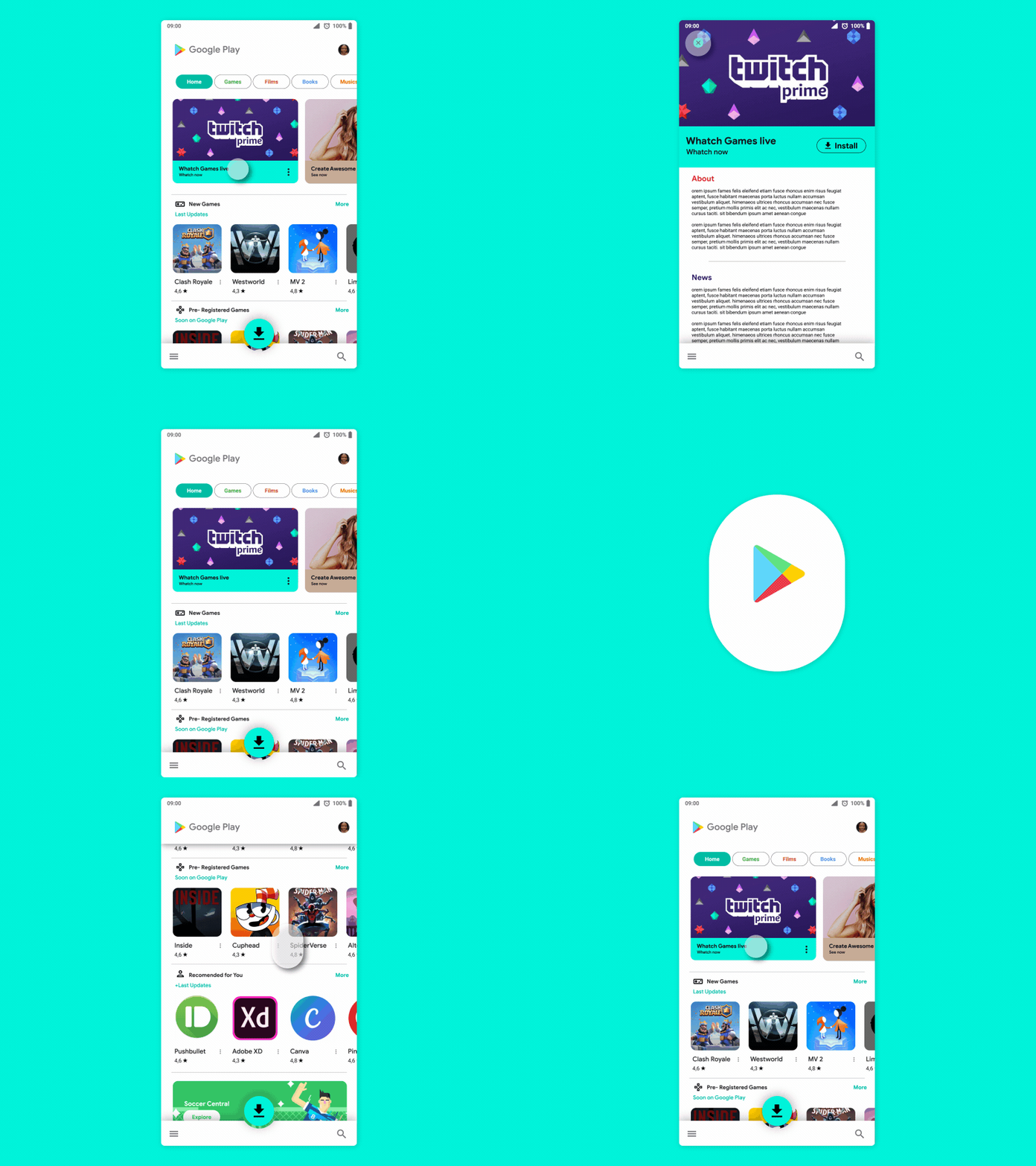
This time the Play Store directly took inspiration from the homepage of Google.com. The entire Play Store UI comes decked with a lot of white space. To utilize the visual cleanliness of this white UI, key menu headings such as Games, Apps, Movies, and Books are now presented in bold colors to help to see the categories with more contrast.
Material Design Support
Play Store UI redesign this time also utilized Material Design principle which has been a key design mainstay in the latest Android versions. The Material design is likely to be more impactful and effective on the Play Store appearance of the apps. By following the same design principle, the separators in the design have also been removed to make way for more visual space.
Tabs Have Been Relocated
To interactions easier, while always giving priority to the cleanliness of the design, the content tabs have been relocated from the upper side to the bottom. This has been particularly done to help users interact with the Play Store with a single hand.
Gesture-based Actions
The improved and renovated Google Play Store design has also introduced full support for the gesture-based actions and the gesture controls. This feature which was inspired originally by the iOS User Experience makes performing on-screen actions further easier.
Removal of the Tab ‘Music App’
Among the few omissions in the new Play Store redesign, one particular aspect which is bound to attract your attention is the absence of a tab for “Music App”. Now the new redesigned Play Store interface comes loaded with just 4 tabs, respectively Apps, Games, Movies, and Books. This is probably done keeping in mind that Google Music is about to be replaced by YouTube Music.
A New UI for Tablets
Apart from all the changes mentioned above the new revamped design also introduced a new UI for the tablets. This dual-plane tablet UI is introduced for the apps to fit well in larger tablet screens.
Make the Preview Screenshots Better
In-app marketing for the apps of any platform, screenshot previews play a very important role. Visually appealing screenshots can actually convince the potential users about the sophistication and ease of use concerning the new app. The redesign of the Play Store in this respect made some significant value additions. From now, as per the orientation of the video, the screenshot slider will be resized. Furthermore, the screenshots will be given a visual boost with larger text size and added visuals to improve business conversion rate.
Equipped for Better Ratings and Review Responses
The revamped Google Play Store redesign emphasized on the reviews and rating sections in the app previews. The new and more visually engaging ratings and review section will help enticing users better.
Utilizing Play Store Presence through Google Universal App Campaign
Google Universal App Campaign (UAC) helps developers to get quality installs without spending a fortune on marketing. Through UAC the marketers can easily connect specific target audience who are likely to feel more interested with your app. As UAC plays a great role in automatically enhancing the creativity of the ads, bids and the allocation of budgets, the new Play Store look and feel of the app will add some positive elements in the overall marketing mix.
How the Users are Going to Appreciate this Redesign?
Well, a new design is not successful until and unless it is championed by fulfilling the user expectations. As Android Q update is about to hit the market anytime soon, Google already has started to push for dark themes in apps. This all-white and cleaner Play Store UI has basically been introduced to help dark themed apps to look beautiful and attractive on the store display.
Undoubtedly, from the perspectives of the users, it is more about the convenience of seeing the apps on the Play Store without any visual distractions. The monochromatic look of the new Play Store UI will be more useful to push the dark-themed UI design for apps. At the same time, this will also boost user engagement and interactions thanks to the reduced visual overload.
How the Redesign will Impact Sales and Marketing of Apps?
Every design decision is motivated by some business insights and objectives. The new redesign can positively impact the sales growth and marketing outcome as well. A redesigned app, website or a play store will certainly boost the business conversation.
It affects different aspects of the business to push up the sales number. Redesigning works on the following aspects:
- Enhanced Usability
- A New Refreshing Look
- More Personalized User Experience
- Better Performance
Conclusion
Google Play Store redesign has been conceptualized as a big positive value addition in the scheme of things for Android app marketers. Though such redesign efforts will continue, the present one can be a starting point for several great things in this direction.


